The colors you choose to represent your brand play a major role in shaping how consumers relate to your products. Make sure the color scheme for your company’s packaging reflects your core values.
Getting a small business off the ground is no easy task. From sourcing your inventory to deciding on your branding strategy, a lot goes into setting up shop on your first day of business. You may be mulling over questions like: How will you design your logo and packaging? What colors will they feature? How will these colors represent my business?
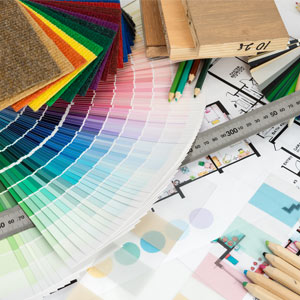
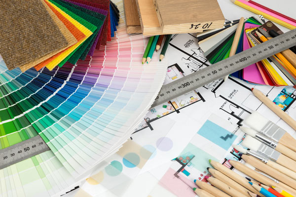
For small business owners just starting out, choosing the right pops of color and creating the perfect color palette is an essential part of their brand story.
Picking the right colors and coordinating your color palette with your packaging materials help shape how consumers relate to your brand identity. This helps tell the story of your business. Let us break it down, color by color so you can create the color palette that speaks to you.
Red
Red creates a sense of excitement, urgency, and is known to stimulate. It is the perfect color to convey a business that is lively and exciting. While this is especially important for businesses that sell romantic products — roses and chocolates during the Valentine’s Day rush, for example — red is also popular for restaurants, chains, and food brands that want to trigger feelings of hunger.
With red standard totes, you can showcase the boldness of your product and excite your customer. Or, use red tissue paper to cushion your custom packaging for an unboxing experience that makes a splash.
Orange
Orange delivers a sense of friendliness, fun, and exudes confidence. For an easy going, casual feel, make a statement using shades of orange.
If this sounds like your style, try using orange burlap to add a pop of color to your customers’ shopping experience. Alternatively, you can accent your products with orange raffia bows that bring high-quality texture to the unboxing experience.
Yellow
Yellow expresses joy, happiness, and overall optimism. If you want to signal homespun approachability to your customers, contrast yellow accents with cooler hues like green or blue.
Whether you go for attention-grabbing glossy yellow merchandise bags or you take custom packaging to the next level with vibrant vinyl tape, yellow will help you make a lasting impression.
Green
Green communicates a sense of relaxation synonymous with nature and health. For companies looking to reinforce their eco-friendly business practices or for wellness brands that want to complement naturally sourced ingredients with natural-looking packaging, featuring green in your branding is a must.
Consider using a green paper euro tote when packaging your products. To really drive home the natural side of your operation, tie up boxes with green ribbons. Customers will appreciate the extra thought!
Blue
Blue creates a sense of security, trust, and dependability. Tech companies and social media sites that handle sensitive information use blue to emphasize their expertise.
If reliability is a core part of your pitch, you’ll likely want to include blue in your branding. Consider blue shopping bags to match the use of the color in your logo or website.
Purple
Purple creates a sense of calm and creativity. For brands that want to demonstrate that they’re not afraid to think outside the box, purple is ideal. Using purple in your branding and packaging shows customers that your company is innovative and willing to take risks that your competitors won’t.
While purple is commonly used to package beauty products thanks to its association with royalty, companies in any industry can adorn their products with purple flourishes such as lavender bows. Doing so clues customers into your creative side, and adds a touch of personality that can be hard to find in the often anonymous world of ecommerce.
White, Black, and Neutrals
White, black, and neutral colors – such as ivory, silver, gray, tan, and beige – can provide the perfect base to your pops of color.
Alternatively, for a muted, understated, and professional brand story use these colors together. A classic black and white aesthetic — or one with a mixture of silver and gray — can ensure that your products are front and center.
For example, black or white paper jewelry boxes can add just the right amount of glamour to your products without taking any attention away from your handiwork.
I’m planning on selling and shipping vintage pottery as well as some collectible toys. Some of the toys are vintage and fun while the others are new. My favorite colors are pink with a shiny gold accent or trim. Rose Gold is what I would like to have on my business cards. What does those colors convey?
Hi Deborah! What a wonderful concept for a shop. Rose gold offers the opportunity to create such a warm and welcoming palette for your business. Can’t wait to see the results!